Monday, October 13, 2008

Learning Statistics Using R: Role Type Classification: Case III (5 of 5)

Now we learn to create a labeled scatterplot using R. In labeled scatterplot we indicate different subgroups or categories within the data on the plot; by labeling each subgroup differently.

Note till now we were using "plot" or "scatter.smooth" function to create our scatter plot, but I have not found a nice and easy method of creating labeled scatterplot using these functions. So instead of these functions we will use another function from "car" package/library.

Recall the hot dog example from case I, in which 54 major hot dog brands were examined. In this study both the calorie content and the sodium level of each brand was recorded, as well as the type of hot dog: beef, poultry, and meat (mostly pork and beef, but up to 15% poultry meat). In this example we will explore the relationship between the sodium level and calorie content of hot dogs, and use the three different types of hot dogs to create a labeled scatterplot.
Lets do this with R using scatter.smooth function
# hotdog.txt is same as TA01_009.TXT
> hotdogdata <- read.table("hotdog.txt", sep="\t", header=T)
> attach(hotdogdata)
> names(hotdogdata)
[1] "HotDog"   "Calories" "Sodium"  
# lets try firt with scatter.smooth function.
# As of version R version 2.6.2 (2008-02-08), 'quanlity' argument
# does not result in a warning but newer version does; pointed out by Gabriele Righetti.
> png("/tmp/hotdogtry1.png", quality=100, width=480)
> scatter.smooth(Sodium, Calories)
# We try added label to this plot using text command/function.
# Bug-Fix: Gabriele Righetti
> text(Sodium,Calories, HotDog)
> dev.off()
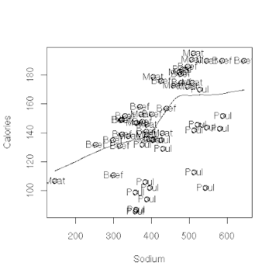
So here is our image, but this is not what we wanted. Here we have tried to add text/label to this using "text" function but it has become too ugly to look at. So now lets try creating a better labeled scatter plot using "car" library.
Lets do this with R using "car" library
# we already have data that is attached. so let first load the
# library.
> library("car")
> png("/tmp/hotdogtry2.png", quality=100, width=480)
> scatterplot(Calories ~ Sodium | HotDog)
> dev.off()
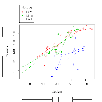
So this is out second graph and this looks much better than our earlier. Also there is an entire moive explaining concept of labeled scatterplot at the course website.

Lets Summarize:
  • The relationship between two quantitative variables is visually displayed using the scatterplot, where each point represents an individual. We always plot the explanatory variable on the horizontal, X-axis, and the response variable on the vertical, Y-axis.
  • When we explore a relationship using the scatterplot we should describe the overall pattern of the relationship and any deviations from that pattern. To describe the overall pattern consider the direction, form and strength of the relationship. Assessing the strength could be problematic.
  • Adding labels to the scatterplot, indicating different groups or categories within the data, might help us get more insight about the relationship we are exploring.

Thursday, October 2, 2008

Learning Statistics Using R: Role Type Classification: Case III (4 of 5)

To remind; we are learning to examine relationship between a response and a exaplanatory variable. In our case III both variables are quantitative (numerical).

We looked at the method to examine case III relationship between two quantitative variables in previous post. Lets understand it better with few more examples.

Example: The average gestation period, or time of pregnancy, of an animal is closely related to its longevity (the length of its lifespan.) Data on the average gestation period and longevity (in captivity) of 40 different species of animals have been examined, with the purpose of examining how the gestation period of an animal is related to (or can be predicted from) its longevity. (Reference: Rossman and Chance, Workshop Statistics. Discovery with Data and Minitab (2001). Original source: The 1993 World Almanac and Book of Facts).

The actual dataset for this example is available here and also as single zip file that includes all dataset of this site.
Lets examine this dataset using R:
# Lets read the dataset animals.dat into R.
# dataset is separated by a tab (\t) and header row 
# is present but not very intitutive so we will 
# change it later.

> animals <- read.table("animals.dat", sep="\t", header=TRUE)
# print names of the rows.
> names(animals)
[1] "animal"   "gestati3" "longevi4"
# we want to change "gestati3" and "logevi4"
> names(animals) <- c("animal", "gestation", "longevity")
> names(animals)
[1] "animal"    "gestation" "longevity"
# so assigning values to names() changes the names.
# now lets draw the scatterplot and examine the dataset.
# we want to create scatterplot in a png file for upload.
> png("/tmp/animal.png", quanlity=100, width=480)
> scatter.smooth(animals$long, main="Lifespan and Pregnancy", 
  xlab="Longevity (Years)", ylab="Gestation (Days)")
# following writes the graph to file. 
> dev.off()
  • Direction: The direction of relationship is essentially positive, that is longer lifespan tends to have have longer times of pregnancy.
  • Form: Again the form of relationship (between response and explanatory) variable is linear.
  • Outliers: There seems to be one outlier at around 40 years. Lets use R to find out which observation is this?
    # we search for more than 35 year, just to be careful.
    > which(animals$longevity > 35)
    [1] 15
    # 'which' provides us with the observation number that has 
    # logevity > 35. Lets display that observation.
    # combination of which along with dataset give following:
    > animals [which(animals$longevity > 35), ]
         animal gestation longevity
    15 elephant       645        40
    

    So our outlier is an observation for elephant. Note that while this outlier definitely deviates from the rest of the data in term of its magnitude, it does follow the direction of the data.
Comments from course site: Another feature of the scatterplot that is worthwhile observing is how the variation in Gestation increases as Longevity increases. Note that gestation period for animal who live 5 years ranges from about 30 days up to about 120 days. On the other hand the gestation period of animals who live 12 years varies much more, and ranges from about 60 days and up to above 400 days.

Example: As another example, consider the relationship between the average fuel usage (in liters) for driving a fixed distance in a car (100 kilometers), and the speed at which the car drives (in kilometers per hour). (Reference: Moore and McCabe, Introduction to the Practice of Statistics, 2003. Original source: T.N. Lam "Estimating fuel consumption for engine size", Journal of transportation Engineering,111 (1985))

The actual dataset for this example is available here (See chapter 2) and also as single zip file that includes all dataset of this site.
Lets examine this dataset using R:
> sf <- read.table("speedfuel.txt", sep="\t", header=TRUE)
> png("/tmp/speedfuel.png", quanlity=100, width=480)
# check column names..
> scatter.smooth(sf$Speed, sf$Fuel, main="",   xlab="Speed (km/h)", 
  ylab="Fuel Used (liters/100km)")
> dev.off()
The data describe a relationship that decreases and then increases - the amount of fuel consumed decreases rapidly to a minimum for a car driving 60 kilometers per hour, and then increases gradually for speeds exceeding 60 kilometers per hour. This suggests that the speed at which a car economizes on fuel the most is about 60 km/h. This forms a curvilinear relationship which seems to be very strong, as the observations seem to perfectly fit the curve. Finally, there do not appear to be any outliers.

Example: Another example and scatterplot taken from course website provides a great opportunity for interpretation of the form of the relationship in context. The example examines how the percentage of participants who completed a survey is affected by the monetary incentive that researchers promised to participants. Here, is the scatterplot which displays the relationship: The positive relationship definitely makes sense in context, but what is the interpretation of the curvilinear form in the context of the problem? How can we explain (in context) the fact that the relationship seems at first to be increasing very rapidly, but then slows down?

Note that when the monetary incentive increases from $0 to $10, the percentage of returned surveys increases sharply - an increase of 27% (from 16% to 43%). However, the same increase of $10 from $30 to $40 doesn't show the same dramatic increase on the percentage of returned surveys - an increase of only 3% (from 54% to 57%). The form displays the phenomenon of "diminishing returns" - a return rate that after a certain point fails to increase proportionately to additional outlays of investment. $10 is worth more to people relative to $0 than to $30.