Tuesday, September 9, 2008

Learning Statistics Using R: Role Type Classification: Case III (3 of 5)

In next few posts we try to understand direction, form, strength and outliers of our Sign Legibility Distance Vs. Age scatterplot.

We try with simple scatterplot and then try to find its direction using R. So this is how our scatterplot looks when drawn using R.
# read the signdistance datafile that is included in here
# http://krishnadagli.blogspot.com/2008/07/learning-statistics-using-r-data-sets.html

> sigdist <- read.table("signdistance.txt", header=T, sep='\t')
# we want to create scatterplot in a png file, that is easy to upload.
> png("/tmp/signdist.png", quality=100, width=480)
> plot(sigdist, main="Sign Distance", xlab="Driver Age(years)", ylab="Sign Legibility Distance(feet)")
> dev.off()


So this how our scatterplot looks, we try to first find the direction of this plot.
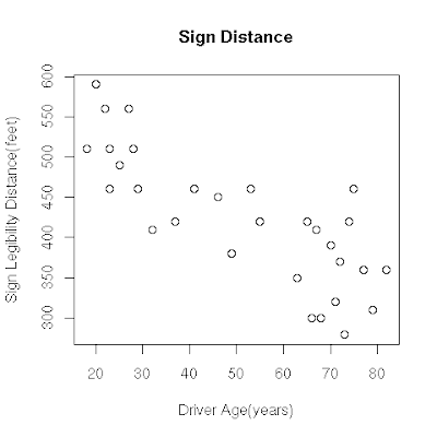
Find direction: (FIXME: Is this correct, what alternatives?): For finding direction of scatter plot we use one of R's function 'scatter.smooth'. The help page says that it plot and add a smooth curve computed by 'loess' to a scatter plot, and Wiki entry here mentions loess, or locally weighted scatterplot smoothing, as one of many "modern" modeling methods. Here is the R code to add a curve to our plot.
# we have already read data in sigdist object, lets use it.
# As we want to create and save the plot, we use png function.
>png("/tmp/sigdistsmooth.png", width=480, quality=100)
> scatter.smooth(sigdist, main="Sign Distance Smooth", 
  xlab="Drive Age(years)", ylab="Sign Legibility Distance(feet)")


Here is how our scatterplot along with a curve looks.
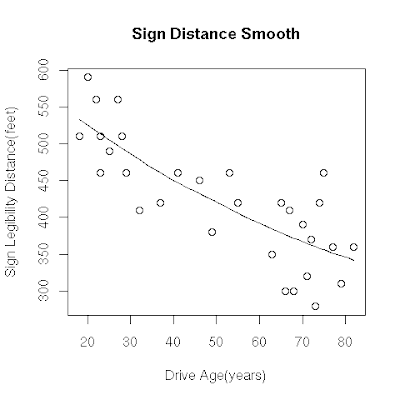
We can see that the direction of the relationship is negative, which makes sense in context since as you get older your eyesight weakens, and in particular older drivers tend to be able to read signs only at lesser distances. (How do we get an arrow drawn over the scatterplot just like its shown in the course?)

Find form: The form of the relationship seems to be linear. Notice how the points tend to be scattered about the line. Although, as we mentioned earlier, it is problematic to assess the strength without a numerical measure, the relationship appears to be moderately strong, as the data is fairly tightly scattered about the line. Finally, all the data points seem to "obey" the pattern- there do not appear to be any outliers.

Friday, September 5, 2008

Learning Statistics Using R: Role Type Classification: Case III (2 of 5)

As we have seen in our previous scatterplot, it is always the case that exaplanatory variable is plotted on horizontal, X-axis and response variable on Y-axis. If, at times we are not able to clearly identify explanatory and response variables then each of them can be plotted on either axis.

Interperting scatterplot: In our case-I we did comparative box plot and in case-II we did comparative bar plot/histogram but now how do we interpret scatterplot? What we dis is to describe the overall pattern of the distribution (of response variable) and any deviations (outliers) from that pattern, we take same approach for scatterplot. That is we describe overall pattern by looking at distribution's "Direction", "Form", and, "Strength" , and along with this we find outliers. Following from the course site puts it in a nice figure.


Lets discuss each of these three in details that describes overall pattern of relationship.
  1. Direction: The direction of the relationship can be positive, negative, or neither. We identify the direction of relationship by looking at how scatterplot's points are moving along with x-y plane. Following figures shows example of positive, negative, and neither directions.
    • Positive direction: A positive (or increasing) relationship means that an increase in one of the variables is associated with an increase in the other.
    • Negative direction: A negative (or decreasing) relationship means that an increase in one of the variables is associated with a decrease in the other.
    • Neither: Not all relationships can be classified as either positive or negative.
  2. Form: The form of the relationship is its general shape. When identifying the form, we try to find the simplest way to describe the shape of the scatterplot. There are many possible forms. Here are a couple that are quite common:
    • Linear Form: Relationships with a linear form are most simply described as points scattered about a line:
    • Curvilinear Form: Relationships with a curvilinear form are most simply described as points dispersed around the same curved line:
    • Other Forms: There are many other possible forms for the relationship between two quantitative variables, but linear and curvilinear forms are quite common and easy to identify. Another form-related pattern that we should be aware of is clusters in the data:
  3. Strength: The strength of the relationship is determined by how closely the data follow the form of the relationship. Let's look, for example, at the following two scatterplots displaying a positive, linear relationship:
    The strength of the relationship is determined by how closely the data points follow the form. We can see that in the top scatterplot the the data points follow the linear patter quite closely. This is an example of a strong relationship. In the bottom scatterplot the points also follow the linear pattern but much less closely, and therefore we can say that the relationship is weaker. In general, though, assessing the strength of a relationship just by looking at the scatterplot is quite problematic, and we need a numerical measure to help us with that. We will discuss this later in this section.
  4. Outliers: Data points that deviate from the pattern of the relationship are called outliers. We will see several examples of outliers during this section. Two outliers are illustrated in the scatterplot below: